What colors are available for POS display stands?
May 14, 2025
Leave a message
In the dynamic world of retail, Point-of-Sale (POS) display stands serve as silent salespeople, captivating customers and driving product visibility. One of the key factors that can significantly impact the effectiveness of these display stands is color. As a leading supplier of POS display stands, we understand the importance of offering a diverse range of colors to meet the unique needs and branding requirements of our clients. In this blog post, we will explore the various colors available for POS display stands and how they can be strategically used to enhance your retail display.

The Psychology of Color in Retail
Color plays a powerful role in influencing human emotions and behavior. Different colors can evoke specific feelings and associations, which can have a profound impact on how customers perceive your products and brand. Understanding the psychology of color is essential for creating effective POS displays that resonate with your target audience.
- Red: Red is a bold and attention-grabbing color that is often associated with passion, excitement, and urgency. It can be used to create a sense of urgency and encourage impulse purchases. Red is particularly effective for promoting sales, clearance items, or limited-time offers.
- Blue: Blue is a calming and trustworthy color that is often associated with reliability, professionalism, and stability. It can be used to create a sense of trust and credibility with your customers. Blue is a popular choice for financial institutions, technology companies, and healthcare providers.
- Yellow: Yellow is a bright and cheerful color that is often associated with happiness, optimism, and energy. It can be used to create a sense of positivity and enthusiasm in your retail display. Yellow is particularly effective for promoting children's products, food and beverage items, and seasonal promotions.
- Green: Green is a natural and refreshing color that is often associated with health, growth, and sustainability. It can be used to create a sense of harmony and balance in your retail display. Green is a popular choice for organic products, environmental brands, and health and wellness products.
- Black: Black is a sophisticated and elegant color that is often associated with luxury, power, and mystery. It can be used to create a sense of exclusivity and sophistication in your retail display. Black is a popular choice for high-end products, fashion brands, and beauty products.
- White: White is a clean and pure color that is often associated with simplicity, purity, and innocence. It can be used to create a sense of spaciousness and clarity in your retail display. White is a popular choice for minimalist brands, beauty products, and home decor items.
Available Colors for POS Display Stands
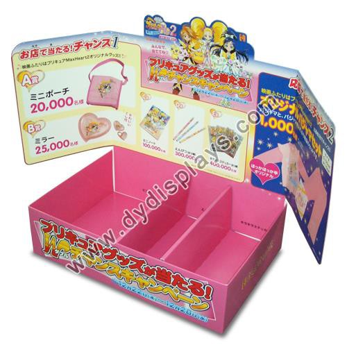
As a POS display stand supplier, we offer a wide range of colors to choose from, including standard colors and custom colors. Our standard colors include black, white, red, blue, yellow, green, and silver. These colors are readily available and can be used for a variety of retail applications.
In addition to our standard colors, we also offer custom color options. If you have a specific color in mind that is not available in our standard color palette, we can work with you to create a custom color that matches your brand's logo or color scheme. Our custom color options are available for all of our POS display stands, including PVC Display Stands, Biscuit Display Stands, and Snack Display Stand.
Choosing the Right Color for Your POS Display Stand
When choosing the right color for your POS display stand, there are several factors to consider, including your brand's logo and color scheme, the products you are displaying, and the target audience you are trying to reach.
- Brand's Logo and Color Scheme: Your brand's logo and color scheme are the foundation of your brand identity. When choosing the color for your POS display stand, it is important to select a color that matches or complements your brand's logo and color scheme. This will help to create a cohesive and consistent brand image across all of your marketing materials and retail displays.
- Products You Are Displaying: The products you are displaying can also influence the color of your POS display stand. For example, if you are displaying food and beverage items, you may want to choose a color that is associated with freshness and health, such as green or yellow. If you are displaying high-end products, you may want to choose a color that is associated with luxury and sophistication, such as black or silver.
- Target Audience You Are Trying to Reach: The target audience you are trying to reach can also play a role in the color of your POS display stand. Different colors can have different meanings and associations in different cultures and demographics. For example, in Western cultures, white is often associated with purity and innocence, while in some Asian cultures, white is associated with mourning and death. When choosing the color for your POS display stand, it is important to consider the cultural and demographic background of your target audience.
Tips for Using Color Effectively in Your POS Display
Once you have chosen the right color for your POS display stand, there are several tips you can follow to use color effectively in your retail display.
- Use Contrast: Contrast is an important element in creating a visually appealing POS display. By using colors that are opposite each other on the color wheel, you can create a high-contrast display that stands out and grabs the attention of your customers. For example, if you are using a black display stand, you can use white or bright-colored products to create a high-contrast display.
- Create a Focal Point: A focal point is the area of your POS display that draws the most attention. By using a bold or bright color in your focal point, you can create a visually appealing display that guides the eye of your customers and encourages them to interact with your products. For example, if you are displaying a new product, you can use a bright color in the background or on the product itself to create a focal point.
- Use Color to Communicate a Message: Color can be used to communicate a message or emotion in your POS display. For example, if you are promoting a sale or clearance event, you can use red or yellow to create a sense of urgency and excitement. If you are promoting a new product or brand, you can use a color that is associated with the product or brand to create a strong brand identity.
- Keep it Simple: When using color in your POS display, it is important to keep it simple and avoid using too many colors. Using too many colors can create a cluttered and confusing display that is difficult for your customers to navigate. Instead, choose one or two main colors and use them consistently throughout your display.
Conclusion
In conclusion, color is a powerful tool that can be used to enhance the effectiveness of your POS display stands. By understanding the psychology of color and choosing the right color for your display, you can create a visually appealing and engaging retail display that attracts customers and drives sales. As a leading supplier of POS display stands, we offer a wide range of colors to choose from, including standard colors and custom colors. Whether you are looking for a bold and attention-grabbing color or a subtle and sophisticated color, we can help you find the perfect color for your POS display stand.

If you are interested in learning more about our POS display stands or would like to discuss your specific requirements, please contact us today. Our team of experts will be happy to assist you and provide you with a free quote. Let us help you create a POS display stand that stands out and drives sales!
References
- Pantone Color Institute. (n.d.). Color Psychology. Retrieved from https://www.pantone.com/color-psychology
- Color Matters. (n.d.). Color and Marketing. Retrieved from https://www.colormatters.com/color-and-marketing
- Retail Design Institute. (n.d.). The Psychology of Color in Retail. Retrieved from https://www.retaildesigninstitute.com/articles/psychology-of-color-in-retail